

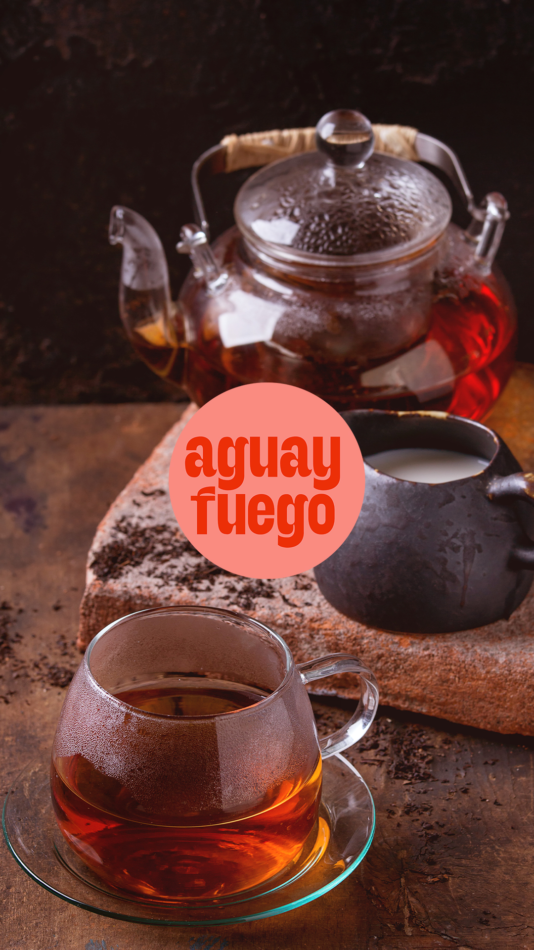
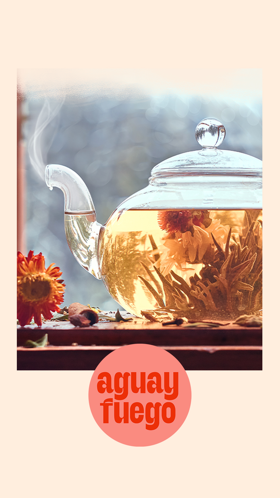
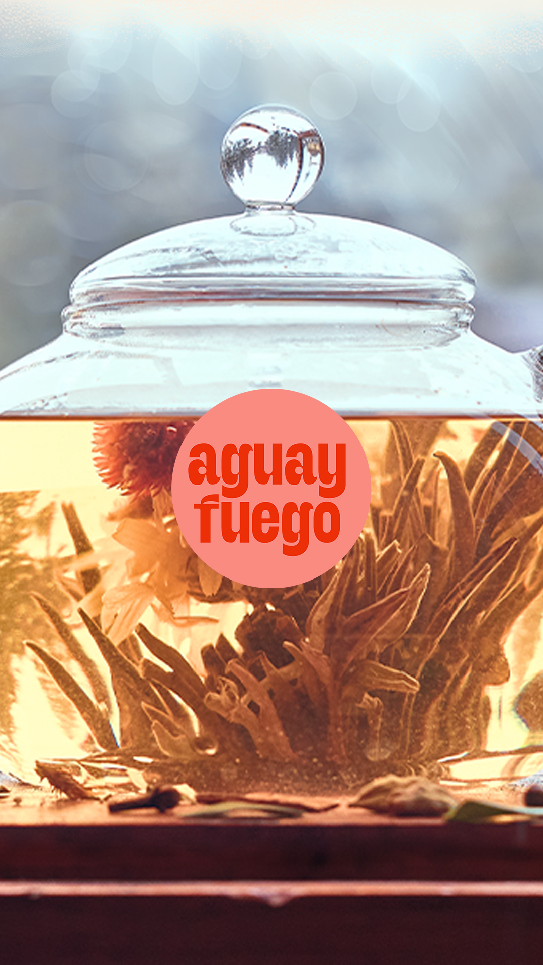
aguayfuego
Visual identity for ficticious tea brand aguayfuego, which celebrates the ritualistic nature of preparing a cup of tea.
The name is a juxtaposition of the Spanish words for water and fire, the two factors that bring out the flavor in tea.
The circle shape is present throughout the packaging: it represents both the shape one sees when drinking tea (a cup’s top view) and the circularity and repetition of the ritual of making this beverage.
There are four characters, each one assigned to a different tea or infusion; the illustrations made for the project emphasize the warmth obtained from preparing and drinking a cup of tea.
The color palette consists of warm tones with a night black for contrast.
The typography -Nicky Laatz’s Seriously Nostalgic- is inspired in magazines from the 1980s, thus reinforcing tea’s warmth.
This project was made as part of the Ambassador Program by Creative Market.

Personal project | Year: 2024 | Sponsorship: Creative Market
Character illustration

Texture in illustrations

Characters
Logo uses

Color palette

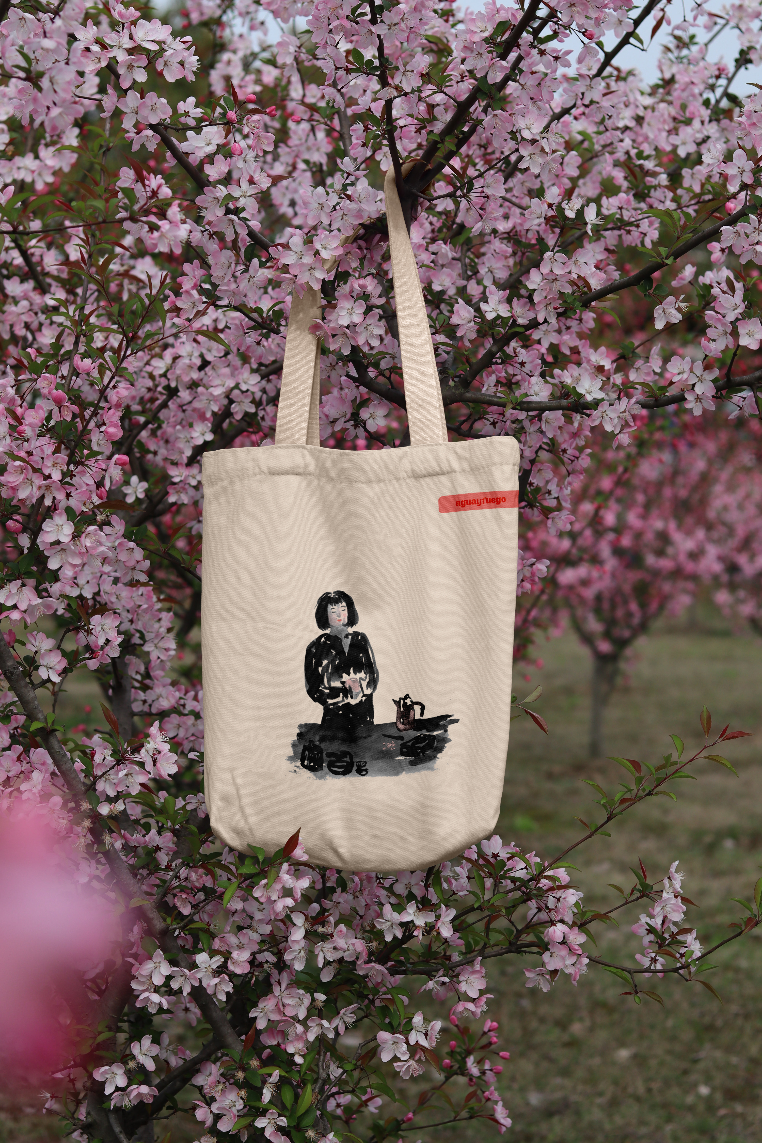


Promotional totebags


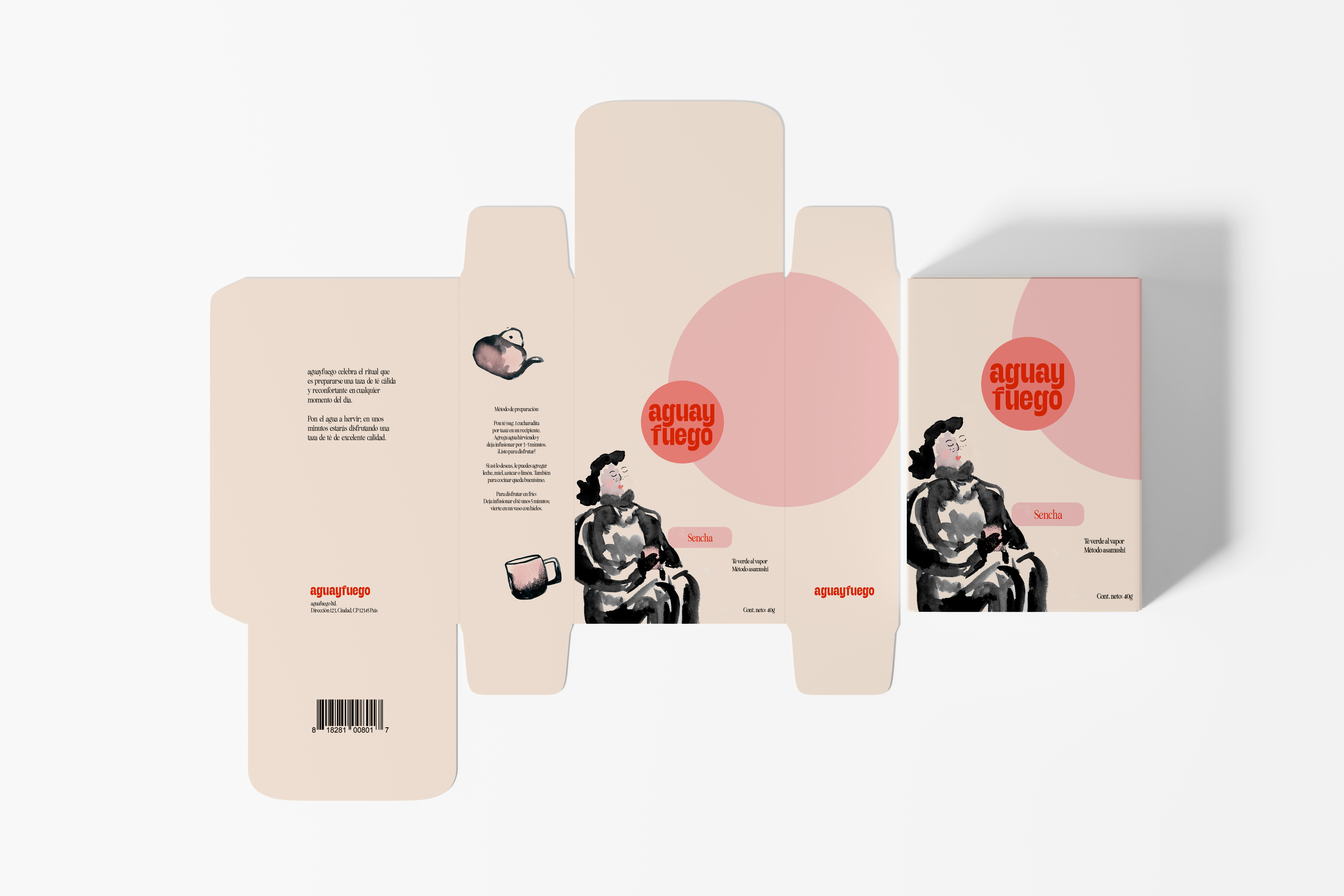
Packaging design
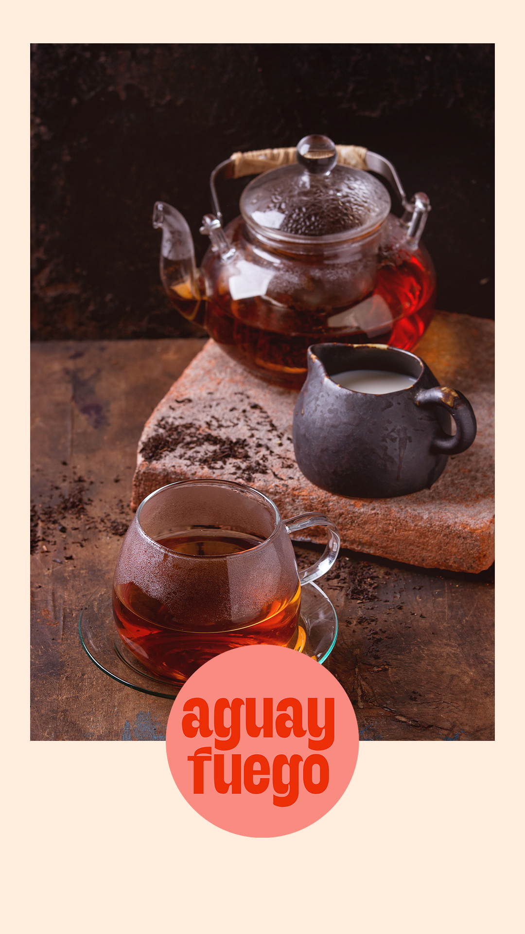
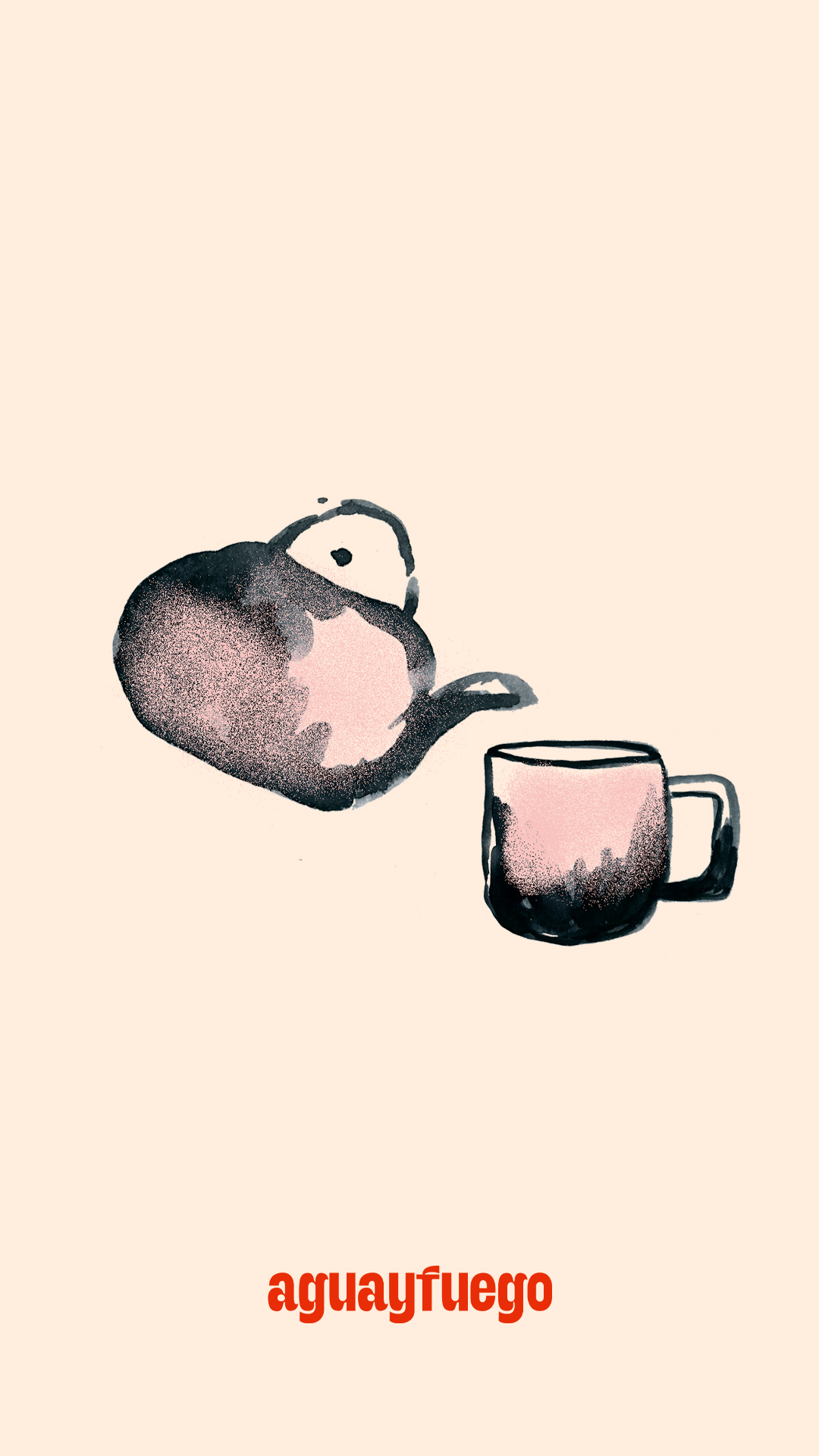
Social media flyers