Client: Archivo Tamayo Year: 2019 - 2020
Art Direction, Branding, Photography
About Archivo Tamayo
Branch of Museo Tamayo Arte Contemporáneo and part of Fundación Olga y Rufino Tamayo that preserves the museum’s newspaper and audiovisual archive.
Archivo Tamayo’s Team
Julio Alvarez
Maestro Pereda
Mrs. Ferrer
Art Direction, Branding, Photography
Archivo Tamayo
About Archivo Tamayo
Branch of Museo Tamayo Arte Contemporáneo and part of Fundación Olga y Rufino Tamayo that preserves the museum’s newspaper and audiovisual archive.
Archivo Tamayo’s Team
Julio Alvarez
Maestro Pereda
Mrs. Ferrer

Museo Tamayo is, since its beginning, a space that collects contemporary art from a local and global market. Its archive branch’s main focus in 2019 and 2020 was to digitalize the newspapers and magazines in its collection with the aim to have it publicly available through its website.
As part of this focus, Archivo Tamayo had the need to construct a recognizable visual identity - aesthetically tied to the museum to show its nearness, but with its own stylistic distinctive flair.

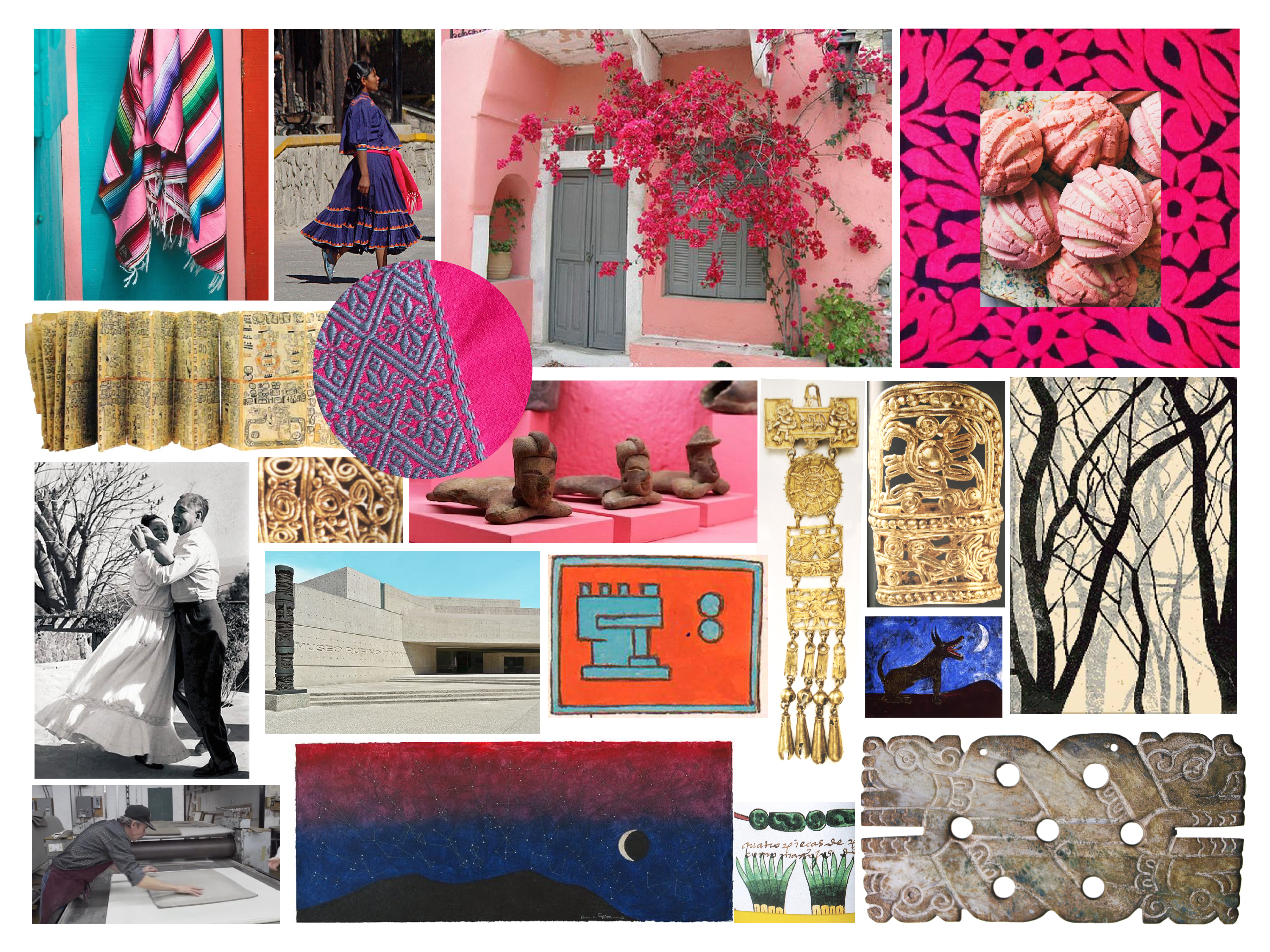
I explored three graphic styles rooted in the museum’s geography, the concept of an archive, and Tamayo’s presence. The selected option takes as starting point the museum’s original imagotype, designed by Rufino Tamayo in the 1980s.
The graphic collaterals that I designed were the following:
- Ex-libris
- Signage for the physical collection’s doors
- Identification tags for containers
- Stationery
Envelope
Business card
- ID cards
- Mug and totebag proposal - for Archivo Tamayo team members and/or for sale in the museum’s gift shop
The selected graphic path takes as starting point the first museum’s identity as an homage to Rufino Tamayo: the same characters and isotype are used with a subtle twist in order to position Archivo Tamayo as a contemporary space, without losing its roots and timelessness.

Left: original imagotype. Right: re-interpretation for the 2020s.
I took as base parts of the original characters in order to create the new ones. The T’s arms are extended as a symbol of a timeline, with the archive anchored in the present (the T’s stem). The dots, originally eyes in the isotype’s figure, allude in this new position to the dots used in a codex: this shows the archive’s Mexican roots, a fact that always made Tamayo proud.

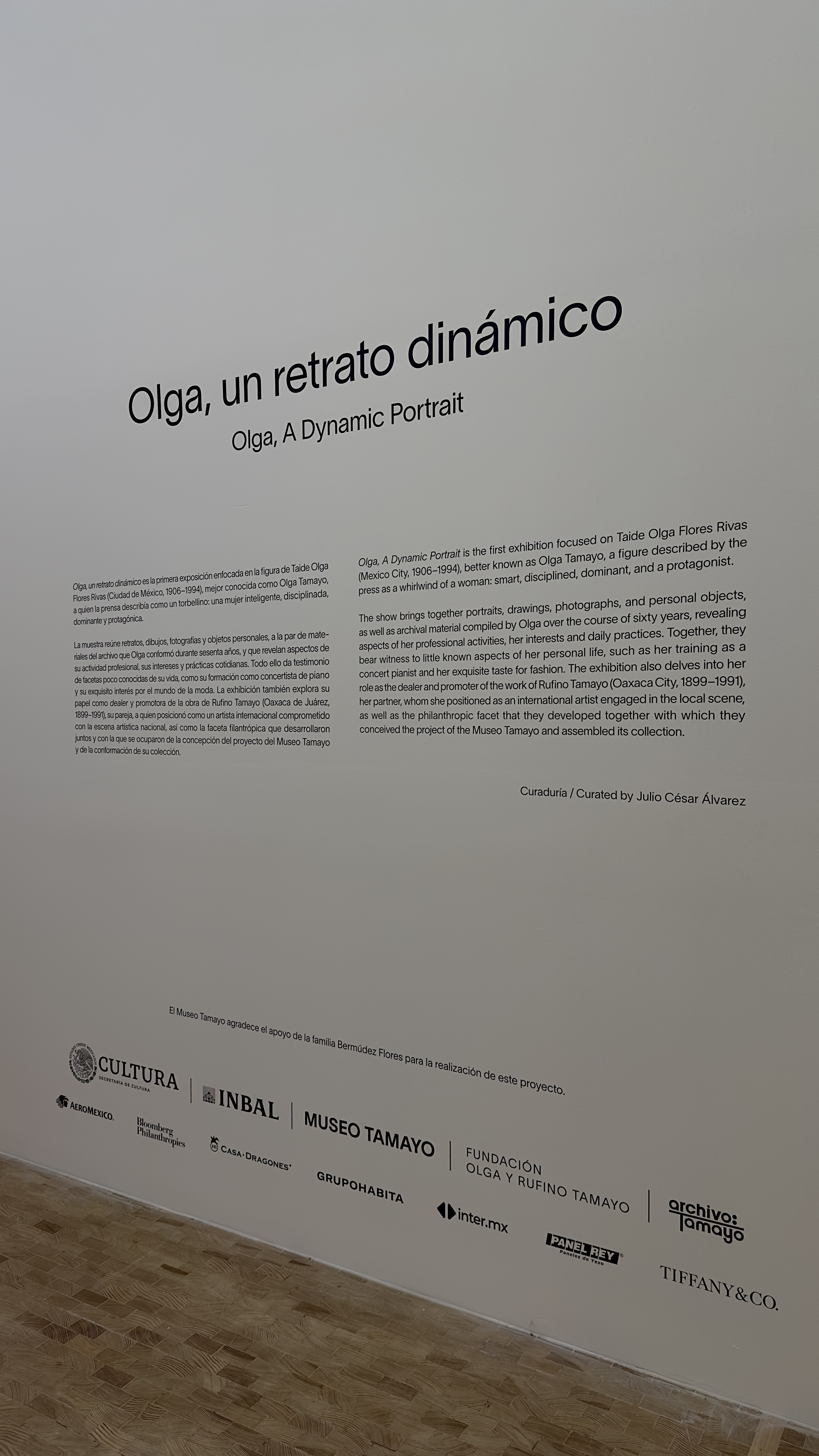
In use for an exhibition. Museo Tamayo, August 2024.

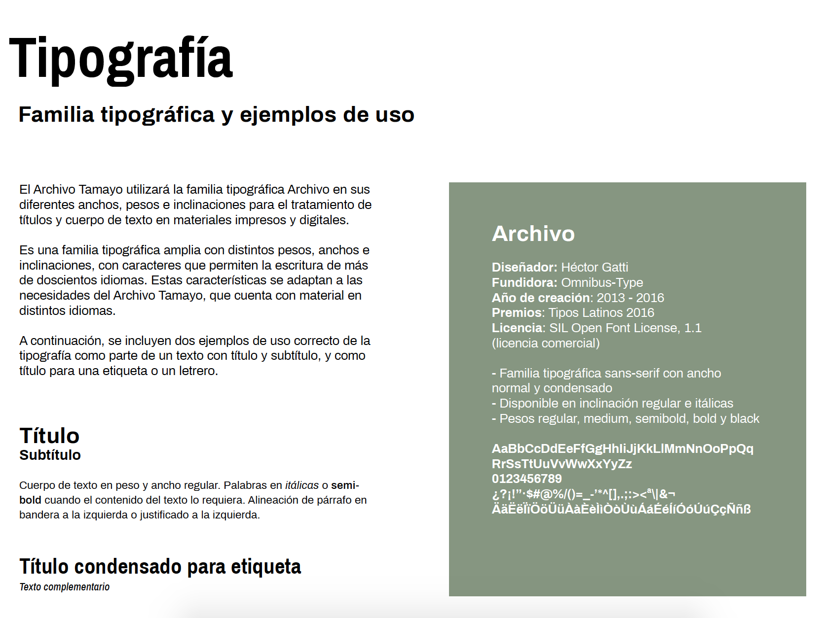
Typography for Archivo Tamayo. Archivo, Omnibus Type.


Mockups for brand collaterals.