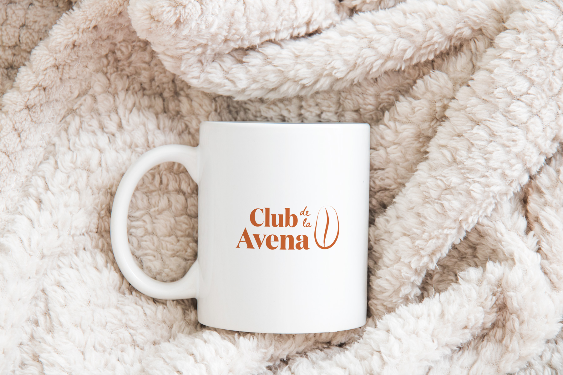
Club de la Avena
Driven by our enjoyment of oats’ flavor and versatility, we designed the identity for a fictional club for other fans of the cereal.
Club de la Avena is an invitation-only club in which members earn their title by the amount of oats they eat in a month. The ranks are informed by the process and production names of the grain.
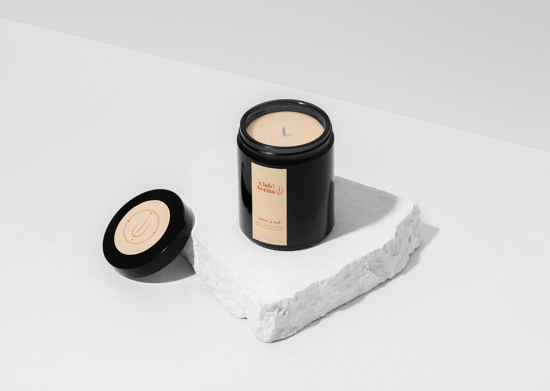
In addition to the visual identity, we designed a line of oat-based products as exclusive merchandise intended for the club’s members, e.g. tote bags, pins, oatmeal cookies, monthly subscription and gift boxes with various oat goodies, and candles.
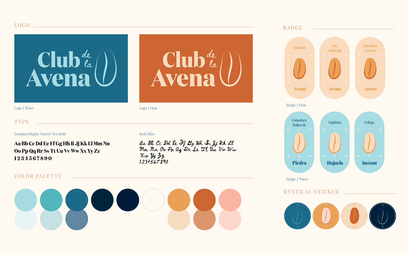
The identity’s colors are in a warm-cold palette that reflects oat’s cooking process: water (cold) with heat. The hues, therefore, are both cold and warm.
The main typeface for the word mark is Domaine by Klim Type: a rounded and warm typeface with a mid-high contrast that reminds one of oat’s characteristics. It is combined with Rob Jelinski’s Beth Ellen, a font with a homemade, individual, warm look to it. The type family for the bodies of text is Julieta Ulanovsky’s Montserrat, for its versatility.
Year: 2020-2021 | Team: Mariana Montes y Luisa Vidales
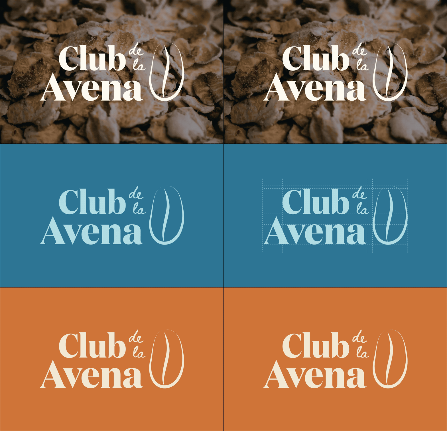 Logo construction
Corporate stationery
 Subscription box
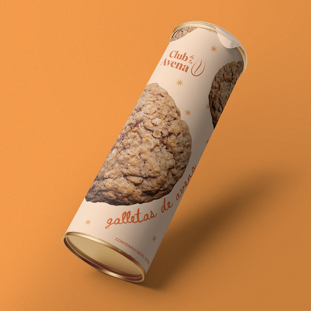





Applied identity
